UKHR logo
 

Incineration

In this section we explain what is meant by the term PM2.5s and discuss the effects of incinerators on public health.


Click here to see a map showing pattern of infant deaths in wards around Edmonton Incinerator


Click here to see a map showing Infant Mortality Rates in electoral wards upwind & downwind of Coventry incinerator


Click here to read Shropshire Star letters on the health effects of breathing in PM2.5 emissions.


Click here to see Dr Woodward's 'scientific' report about Ironbridge Power Station. Note that her report has no 'control' in an area free from PM2.5 emissions from the power station or any other source and lacks any data or journal references.


Border image SELCHP & Infant Death Rate Changes Graph Border image
 

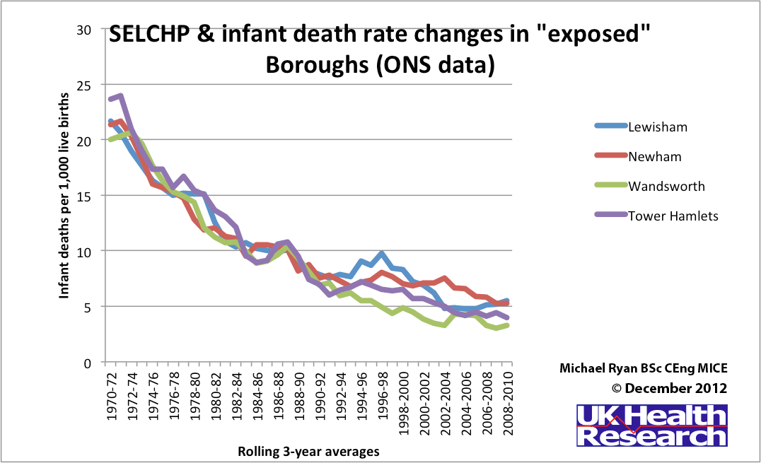
This graph illustrates the changes in Infant Death Rates in three Boroughs exposed to emissions from the SELCHP incinerator located in South Bermondsey, London. Note that Wandsworth is mainly "upwind" of SELCHP and therefore relatively free from emissions.

See Japanese study of infant deaths around 63 incinerators which concluded:

"Our study shows a peak-decline in risk with distance from the municipal solid waste incinerators for infant deaths and infant deaths with all congenital malformations combined."
(J Epidemiol. 2004 May;14(3):83-93.)

SELCHP graph

Click the graph to see it at a larger size.

 
Border image Border image Border image